
Font Awesome Icons are already built-in to LibGuides. Current version is 4.7. Font Awesome gives you scalable vector icons that can instantly be customized — size, color, drop shadow, and anything that can be done with the power of CSS. Find out how in this box. The next box provides some samples to use in LibGuides.
You won't see the new symbol until you have saved the box. Be careful - if you then go back to edit that particular line in Rich Text view, the font awesome code will disappear.
You can add a Font Awesome icon to a box heading - insert the code before or after the box title - see example on this box.
Best Practice when working in source code view is to take a complete copy of the Source Code (html) and paste into Notepad, in case your coding goes wrong. You can then paste the original code back and try again.
To add Font Awesome icons directly to your text use <p><i aria-hidden="true" class="fa icon-name"></i> Text</p>
Note: "aria-hidden=true" should be included in the font awesome code as it makes your icon "accessible". The icon is purely decorative, so it will not be seen by screen reader software.
To increase icon sizes: add one of these codes: fa-lg (= 33% increase), fa-2x, fa-3x, fa-4x, or fa-5x.
So to increase the size of the icon and insert directly to your text use fa-lg or one of the other sizes above <p><i aria-hidden="true" class="fa fa-wifi fa-lg"></i> Text</p>
This Wi-Fi symbol is standard size
This Wi-Fi symbol is a larger size
To change the font colour used:
Add this style code - where the #number matches the required hex colour: <p><i aria-hidden="true" class="fa fa-wifi" style="color:#800080;"></i> Text<p/>
The hex number #800080 is the standard purple used in LibGuides. Hex colours can be found on the web e.g. W3Schools.com/colors
You can also use RGB colours <p> <i aria-hidden="true" class="fa fa-wifi" style="color: rgb(255, 51, 204);"></i> Text </p>
This Wi-Fi symbol is purple and even larger
To increase icon size, use px sizes <p><i aria-hidden="true" class="fa fa-bicycle" style="font-size:60px;"></i></p>:
Size 60px: Size 80px, Blue:
Coloured buttons with hyperlinks can be added to LibGuides - as shown in the images below.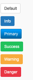
Select the button colour required and use the matching source code below. Copy the required code into Notepad before copy/pasting into the Source view of Rich Text boxes. Edit the label and URL in the button code to suit requirements and enclose with <center> </center> tags as required.
For example: <p><center><a class="btn btn-info" href="http://www.google.com" target="_blank">Search Google</a></center></p> changes the label from Info to Search Google and centres the button.
Basic code for all colours:
<p>style="color:#800080;" <a class="btn btn-default" href="http://www.google.com" target="_blank">Default</a></p>
<p><a class="btn btn-info" href="http://www.google.com" target="_blank">Info</a></p>
<p><a class="btn btn-primary" href="http://www.google.com" target="_blank">Primary</a></p>
<p><a class="btn btn-success" href="http://www.google.com" target="_blank">Success</a></p>
<p><a class="btn btn-warning" href="http://www.google.com" target="_blank">Warning</a></p>
<p><a class="btn btn-danger" href="http://www.google.com" target="_blank">Danger</a></p>
To change the size of the button, add this code (after the btn code):
btn-lg large
btn-sm small
btn-xs extra small
btn-block block level buttons — span the full width of the box
For example:
<p><a class="btn btn-success btn-block" href="http://www.google.com" target="_blank">Full width button</a></p>

WASLA Teacher Librarian of the Year- 2017: Jo-Anne Urquhart
- 2016: Lise Legg